
How to design your Add to Cart Section on your Website
Most CPG founders lose their customers with their “Add to cart” Section. This could be costing you thousands.
When building a brand you might be getting caught up in social media strategy, brand design, trade shows, etc. All other things are equally important, but what about when a potential buyer lands on your website. Then what?
You are silently turning your website into an expensive tool instead of an ATM.
I get it, most customers are purchasing consumer brands in bulk on amazon or in retailers, but that does not mean you get to half ass your website.
Every word on your website counts. It doesn’t stop at your headline.
Here are 6 examples of “Add to cart” sections perfectly designed to convert:
2 CTA Options

This is perfect for big websites where users are likely to continue shopping for multiple products, yet not ready to check out.
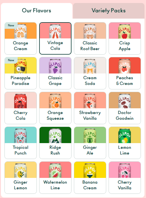
2. Flavor & Size
Always remember people buy with their eyes. This visual shopping experience is the perfect UI shopping experience. A dropdown menu with words just isn’t the best sell. Take it from a copyWRITER.
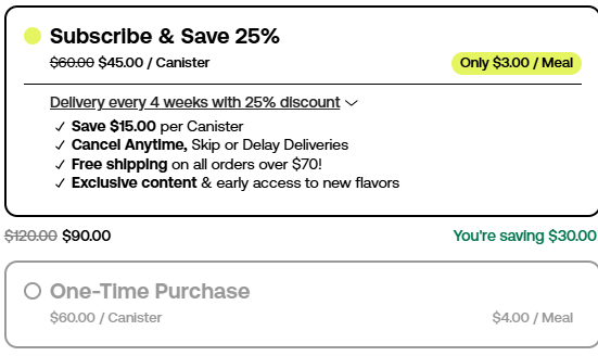
3. Subscribe & Save
This is the best method to retain repeat customers. Do not give your customers the option to forget to repurchase your product. Handle this problem from the initial purchase.
4. Try a Sample
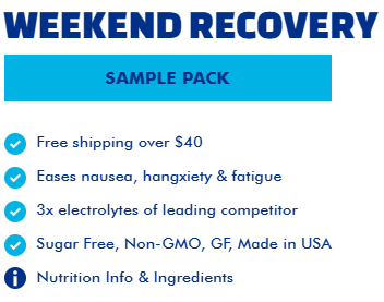
If you sell a product that is hard to return or large in quantity, selling samples can help customers avoid making a purchase they regret and a return with a major financial loss.
5. Care & How to Use
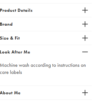
The worst is spending your hard earned money on something and running it because you weren’t aware it needed special care. Do the upfront work for your customers.
6. Product Rating
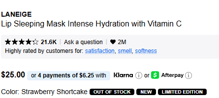
For shoppers who have their mind made up about 98% of the way, this is that extra 2%. Customer ratings give them the purchase confidence needed to confirm the quality of the product is what they believe it is.
Let me guess your Add to cart section is missing all if not majority of these?
Sorry, but it may be the reason your website has such a high bounce rate.
The Add to Cart section is one of the final stops before a customer hits checkout. If yours is lacking, we need to talk.
👉🏽 Inquire about my Top Shelf service, and never have to worry about this page again.