
How to write Opt-in copy that gets email subscribers
How to write Opt-in copy that actually gets email subscribers
If your opt-in box currently says something like “sign up for tips, promos, and discounts,” go ahead and delete it. Otherwise, you might as well not have an email. I promise you that line has never convinced a single soul to type their email. Do you want consistent sales or not? Because if not, then don’t even finish this blog post.
As a CPG brand, the worst thing than having zero email subscribers is unengaged subscribers. Your email list is your best chance at conversion; it's your highest-intent audience. These people willingly choose to receive promotions and updates from your brand. They are begging for you to give them something worthwhile.
So this promise starts with your opt-in copy.
Think of it like your homepage headline’s equally important sibling. This message will disrupt their scroll, so you only have a few seconds to persuade them NOT to click the exit button. Make them think “Oh, this brand gets me, lemme not waste any time.”
Here are 5 CPG brands with Opt-in Copy that convert to email subscribers:
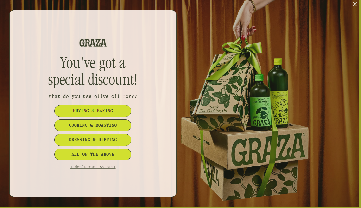
Graza ~ Give them something right away.
Graza's quiz-style opt-in sends visitors directly to the product that best fits their answer. Instead of beating around the bush and giving them the option to explore everything, and potentially get confused. Knowing exactly who they are and what they need directs them to the specific product or solution. And if they try to exit, make them feel like they are missing out. Graza isn’t playing the “sign up for updates” game.
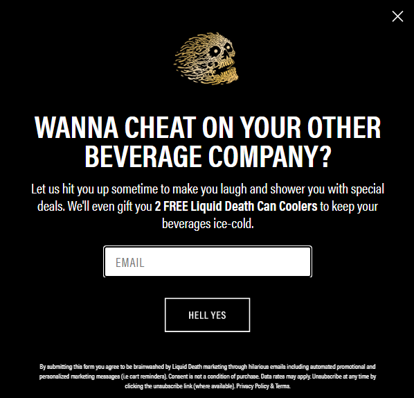
Liquid death ~ Make visitors laugh.
Liquid Deaths opt-in copy legit made me crack up. This brand's messaging is so consistent at every touch point. I like to name their branding theme as “morally corrupt” (word to Camille Grammer ~ iykyk). This is the exact unhinged messaging you would expect from a brand named Liquid Death. Humor makes your brand memorable and trustworthy. Additionally, this is a way to target potential buyers who are skeptical; this helps their decision-making process.
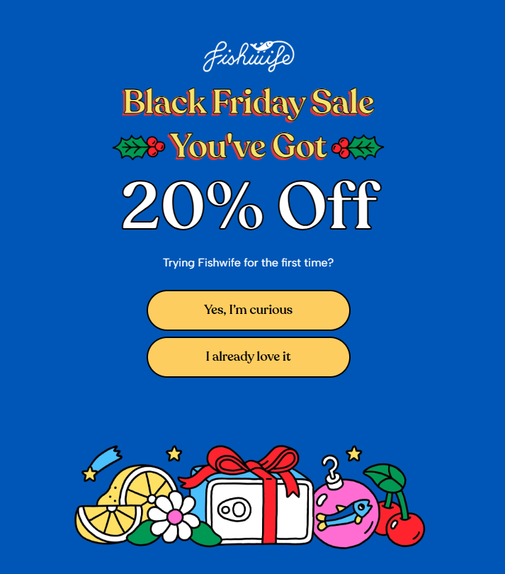
Fishwife ~ Guilt your visitors with FOMO.
The CTA copy is the most overlooked aspect of the perfect opt-in. Sometimes “sign up” just won’t cut it.
Their copy makes you reflect:
“Do I really want to miss out on this?”
“Do I want to be the only one not in the club?”
This is a great example of Fishwife using familiarity and welcoming energy to drive sales. If you aren’t already part of the family, the door is wide open.
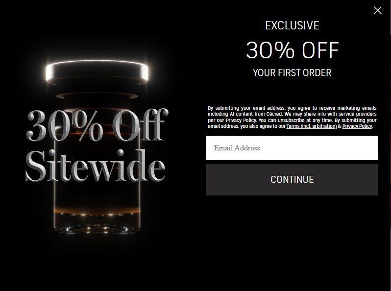
Cecred ~ Make the benefit straightforward. Create a sense of urgency.
Your website copy should shift with the season. This includes adjusting your copy to reflect current sales and promotions. By being straightforward about the benefit, your customers are more likely to jump on it than wait around. And urgency leads to a faster conversion.
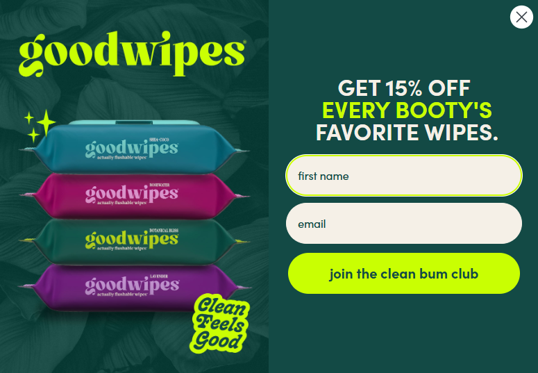
Goodwipes ~ Make people join your club.
A product like butt wipes is, but Goodwipes makes them feel like a lifestyle item. Their copy positions them as an elite club you’d want to be part of. They don’t want to sign up; they want to belong.
The bottom line is you have to work for that email subscription. Nobody cares about tips, tricks, and discounts. What is so great about being part of your club? Make visitors want to keep riding with your brand in the long run.
Make people want to be a part of the party. Nobody cares about tips, tricks, and discounts. What is so great about being part of your club?
If this is something you’re struggling with, I guarantee I can find a few other copy mistakes sprinkled across your website that are costing you thousands. I’d be happy to audit your DTC site.
Check out our drink menu here.